Background
Last week my colleague showed me a drawn graph and asked can we plot this kind of graph. It is a graph with grouped boxplot. Additionally, it contains a trend line that connects mean of each data box. So this post explains how to draw a graph like that using two ways;
- r ggplot2 library
- r base plots (using codes from The R Graph Gallery)
The data
This data is sample data set from my colleague. The data contains VI (Vegetation Index) time series values for three different crops extracted from Landsat 8 data.
Load data
Load libraries
library(ggplot2)
library(readr)
library(plyr)
library(dplyr)
library(RColorBrewer)
Read and prepare data
read.df <- read.csv("D:/Blog_data/sample_ts.csv", header = TRUE)
sample.df <- read.df # Make a copy of the read table

levels(sample.df$date) # Checking the levels in the date column
## [1] "April" "August" "July" "June" "May" "September"levels(sample.df$crop) # Checking the levels in the crop column## [1] "Crop 01" "Crop 02" "Crop 03"# Reorder levels
sample.df$date <- factor(sample.df$date, levels = c("April", "May", "June", "July","August", "September"))
sample.df$crop <- factor(sample.df$crop, levels = c("Crop 01", "Crop 02", "Crop 03"))Plot with ggplot library
# Create a color palette for three crops
my_colors = c("greenyellow", "gold3", "darksalmon")

# Create a plot
ggplot(data=sample.df, aes(x=date, y=NDVI, fill=crop)) +
  geom_boxplot() + ylim(c(-0.2,1.2)) +
  stat_summary(fun.y=mean, colour="red",
               geom="point",position=position_dodge(width=0.75)) +
  stat_summary(fun.y=mean, colour="red", aes(group=1),
               geom="line", lwd=1, lty=1) +
  theme_bw(base_size = 12) +
  scale_fill_manual(values = my_colors, name = "Crop Type", labels = c("Crop 01", "Crop 02", "Crop 03")) +
  labs(x="Date", y="VI",
       title="Phenology of the selected crops",
       subtitle="VI extracted from Landsat 8 time series data")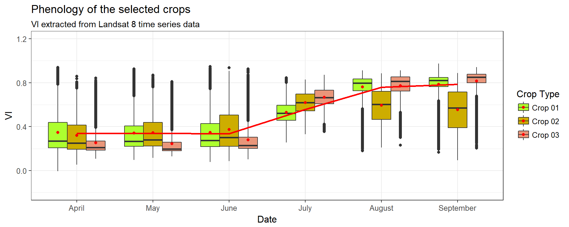
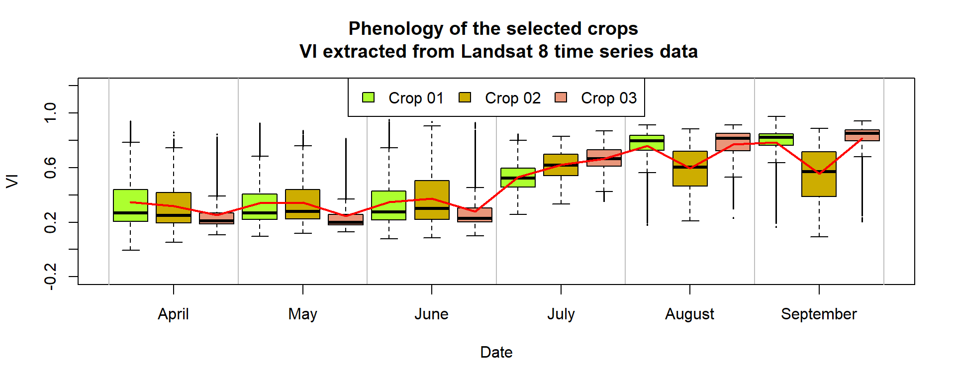
Plot with base library
# Make the boxplot
boxplot(sample.df$NDVI ~ sample.df$crop+sample.df$date , ylim=c(-0.2,1.2), xaxt="n" , xlab="Date" , col=my_colors , pch=20 , cex=0.3 ,
        ylab="VI", xlab="Date",
        main="Phenology of the selected crops \n VI extracted from Landsat 8 time series data" )
abline(v= seq(0, 3*6, 3) + 0.5 , col="grey")
axis(1, labels=levels(sample.df$date) , at=seq(2,3*6,3) )


# Add general trend
a=aggregate(sample.df$NDVI , by=list(sample.df$crop, sample.df$date) , mean)
lines(a[,3], type="l" , col="red" , lwd=2)


#Add legend for crops
legend("top", fill = my_colors, legend = c("Crop 01", "Crop 02", "Crop 03"), horiz = T)